Watsons Bay Boutique Hotel
Challenge
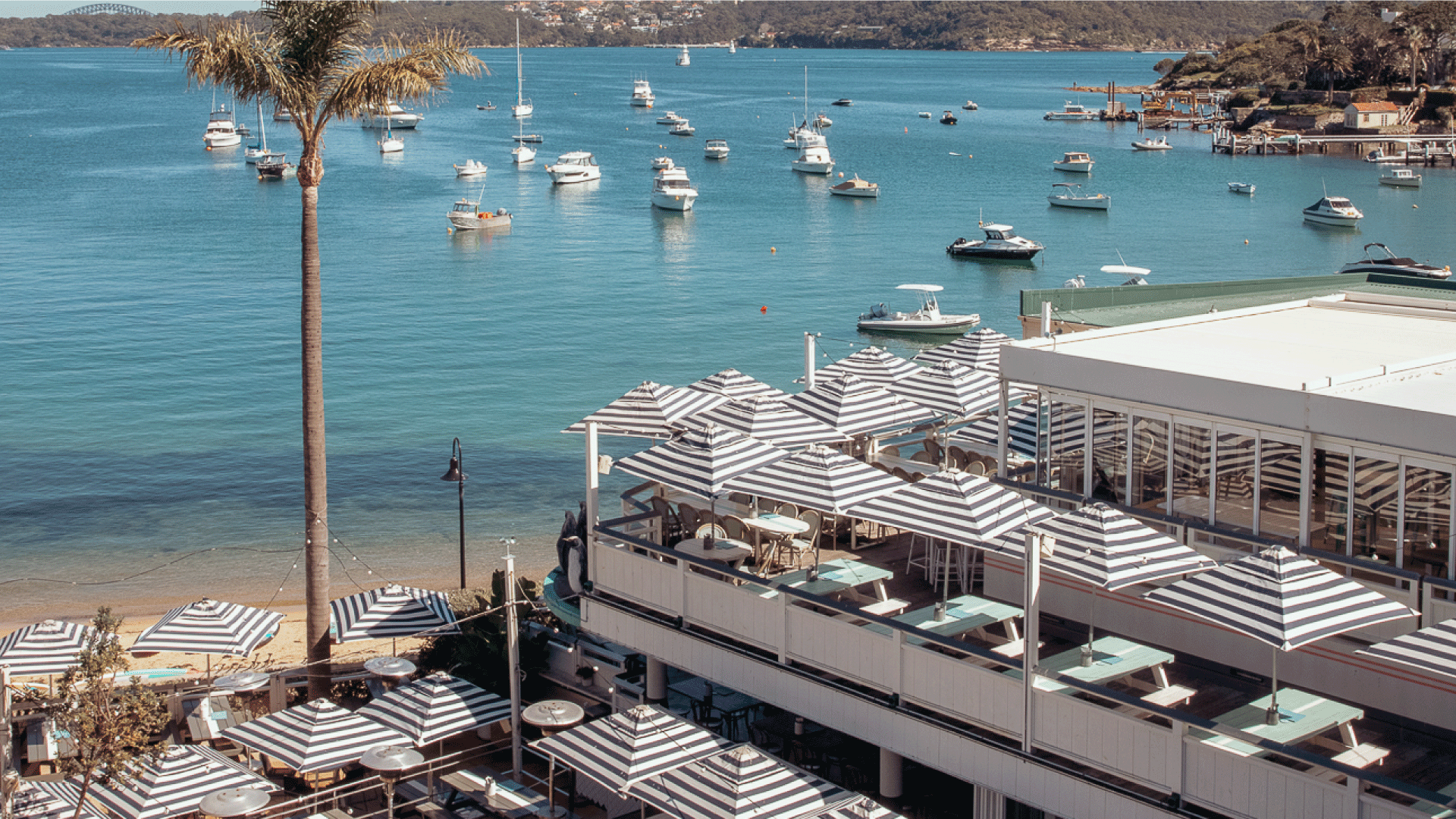
Breathing new life into an iconic beachside Sydney landmark. Watsons Bay Boutique Hotel is one of Sydney's most beloved coastal institutions, a sun-soaked escape at the edge of the harbour that has drawn locals and visitors for generations. As Senior Designer at Sydney Collective, I’d seen the venue up close through years of brand activations, and it was clear: the identity hadn't kept pace with the experience it was promising. The challenge wasn't just a visual refresh. It was capturing something harder to pin down, the feeling of arriving at Watsons, the particular lightness of it.
Client
The Sydney Collective
Services
Brand Design
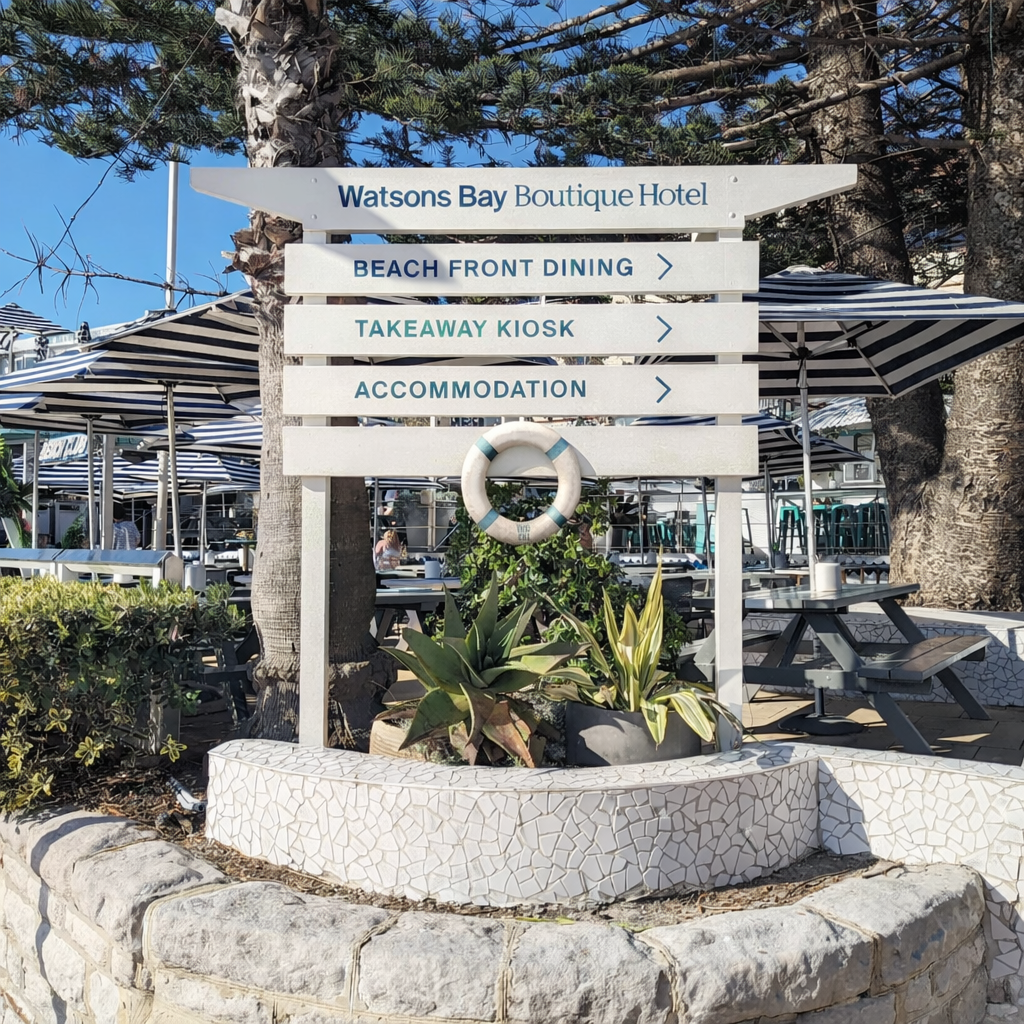
Signage
Credits
Art Direction: Ali Ozden Design: Ali Ozden, Lauren Dannenberg, Phoebe MackayFood Photography: Jared Lyons
Strategy
To bring in an outside perspective and sharpen the concept, I brought in Ali Ozden, an Art Director from Universal Favourite, to collaborate with our in-house team. Ali led the foundational style work; our team carried it forward into applications and full venue implementation.
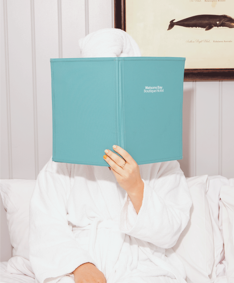
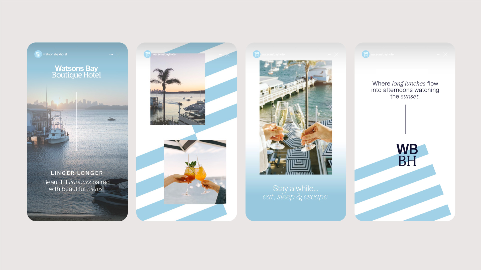
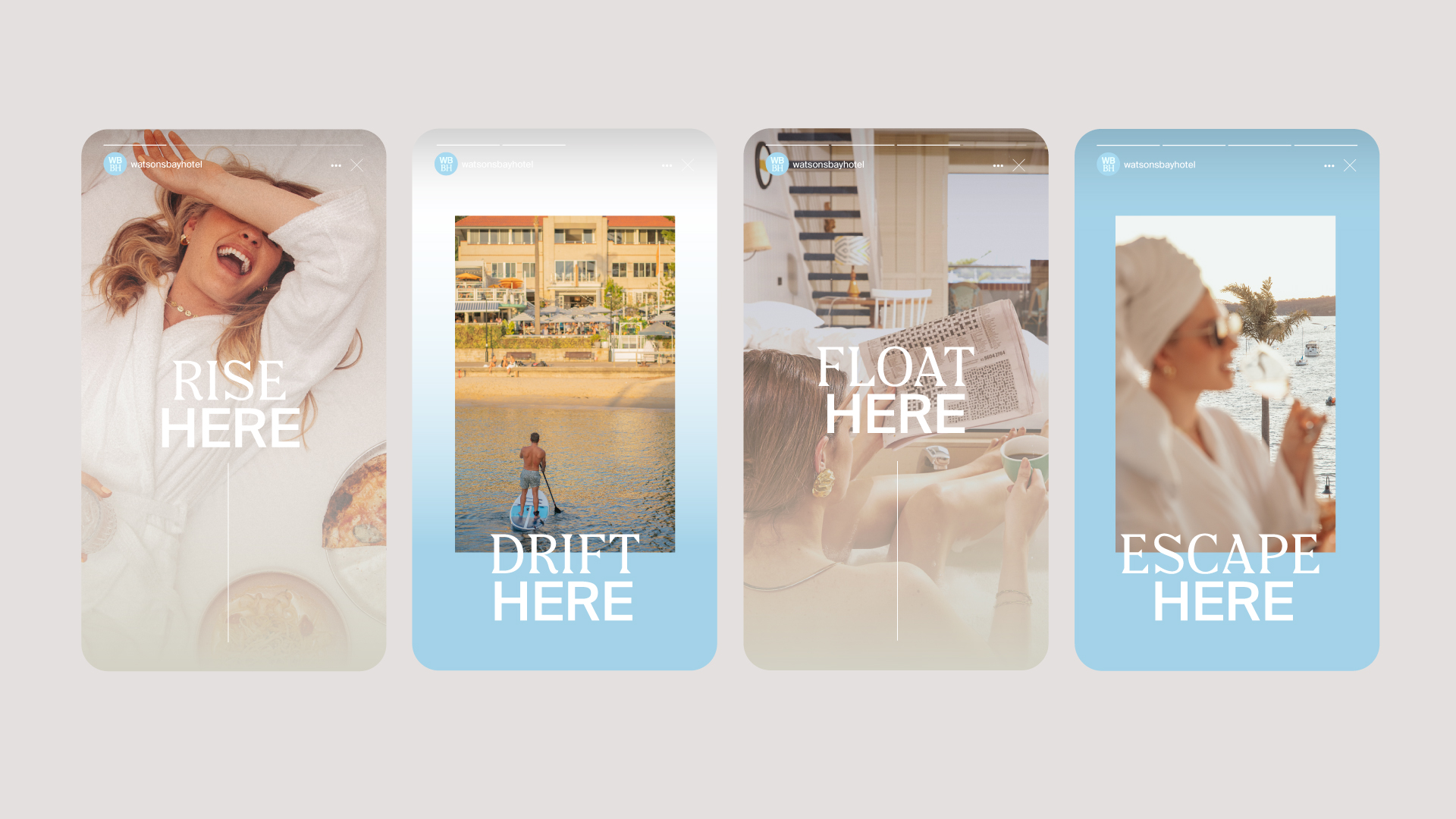
Stepping into Watsons should feel like setting your worries down at the door. That sensation of carefree, sun-warmed weightlessness became the brand's guiding idea: floating. Not as a literal motif, but as a principle that would shape every decision, from layout and motion to photography and art direction. Everything in the identity was asked to earn its place against that feeling.

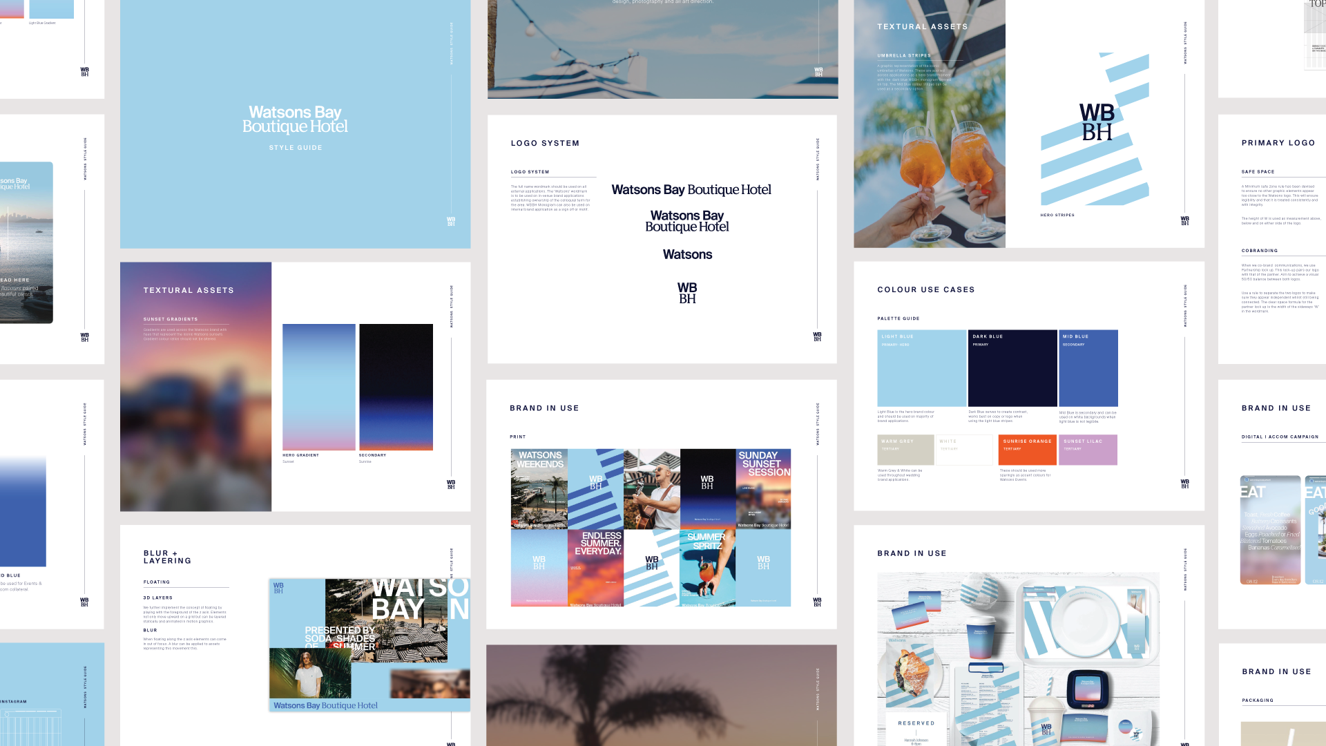
Identity
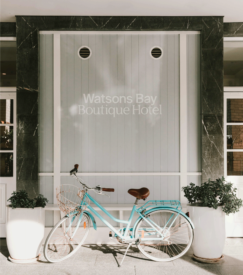
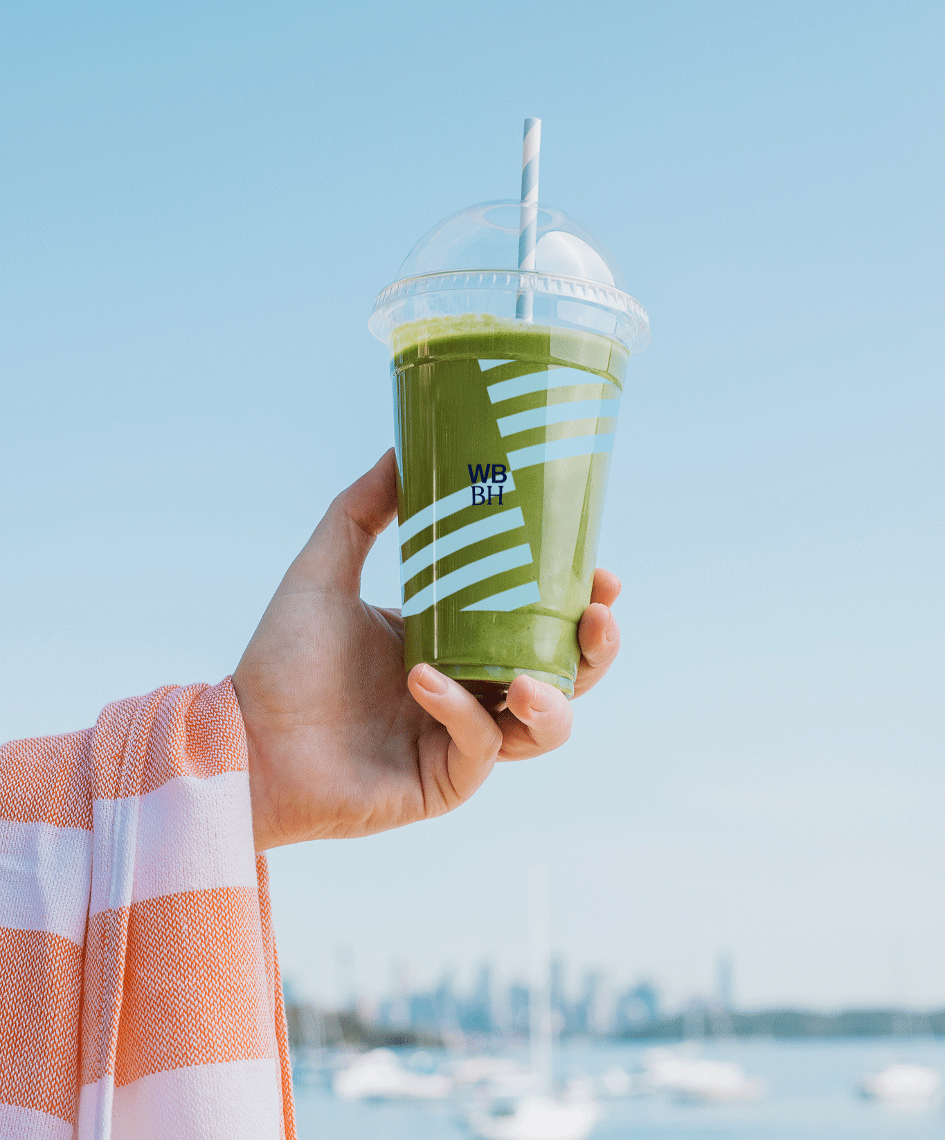
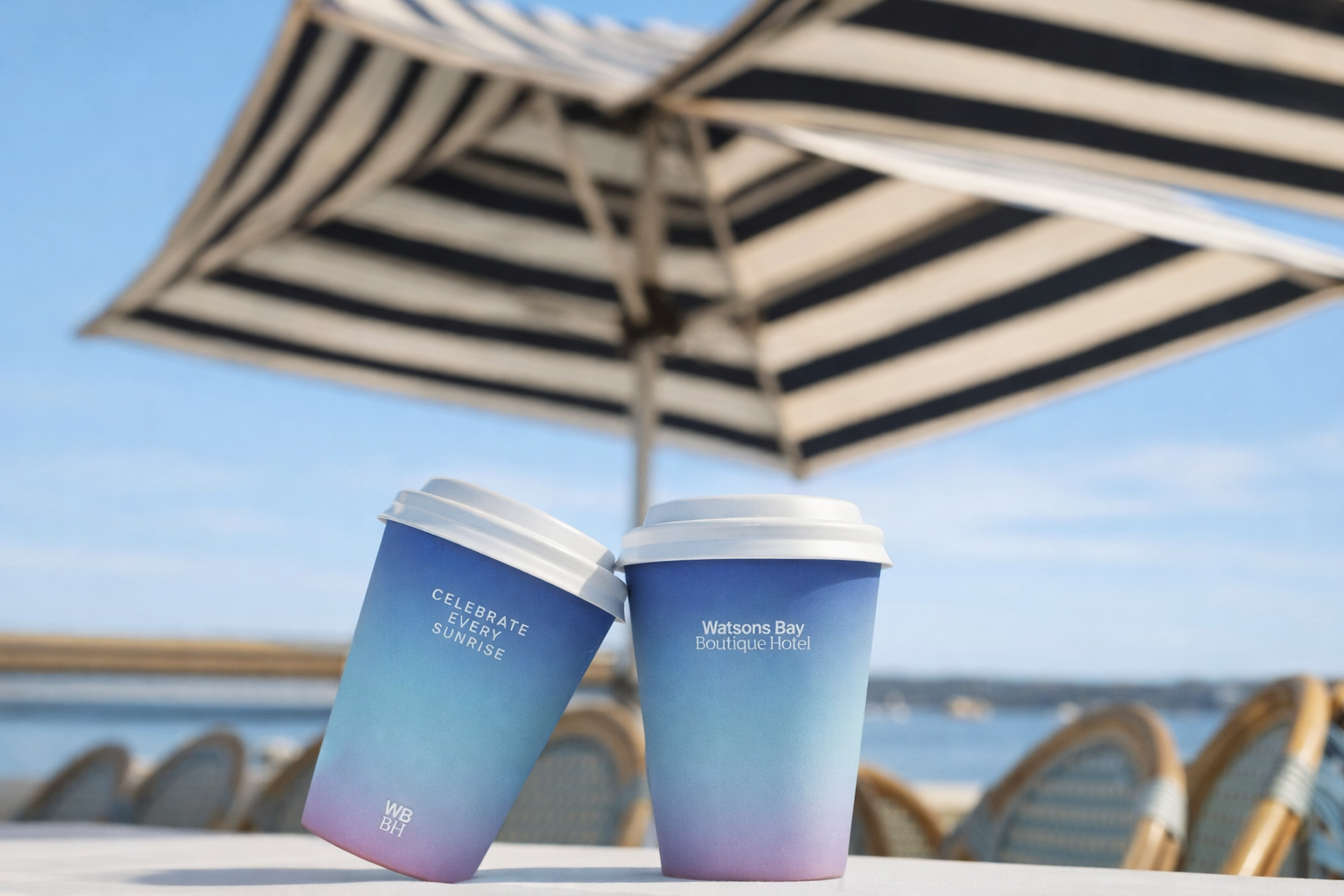
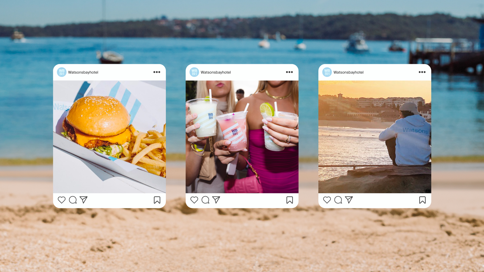
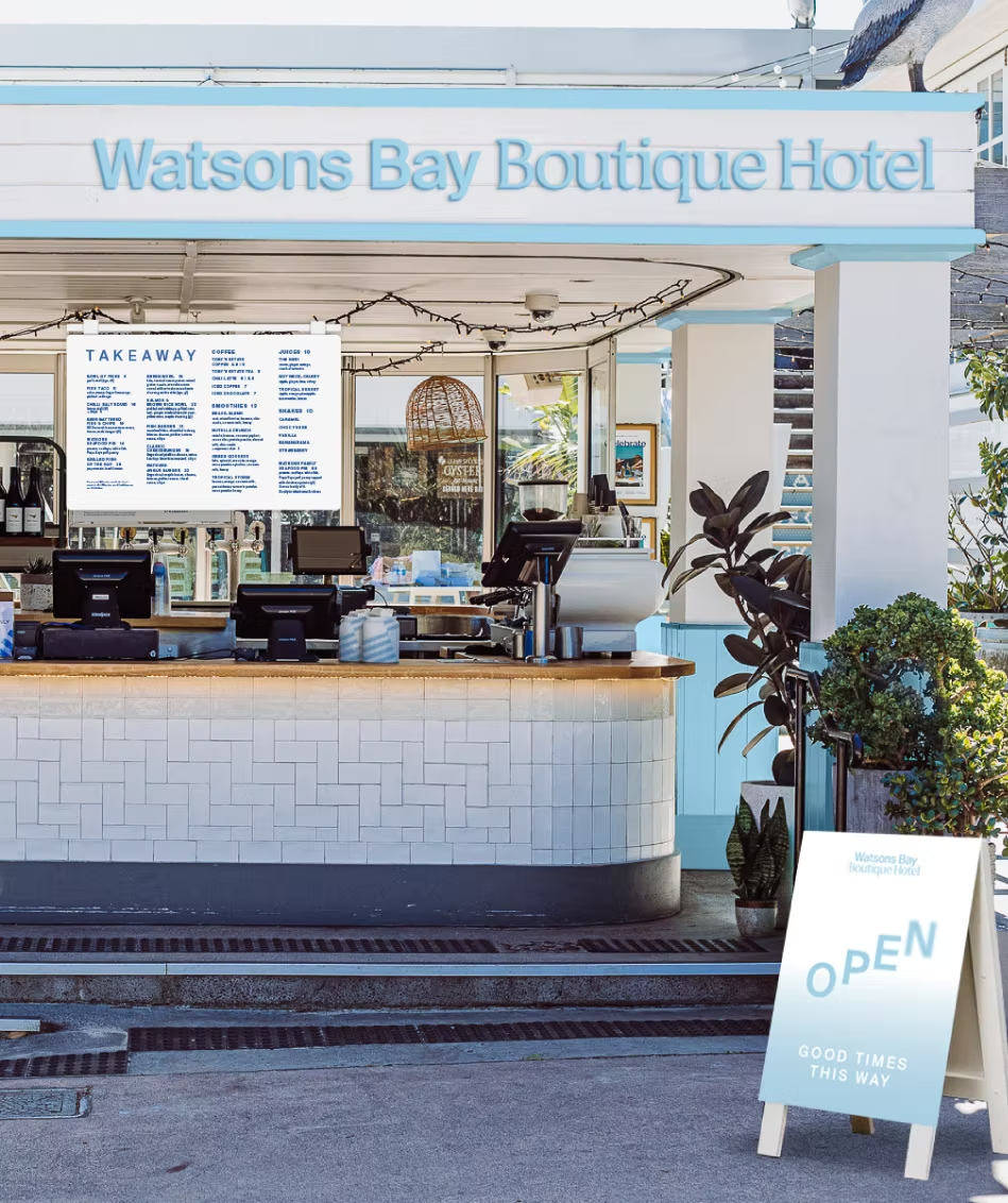
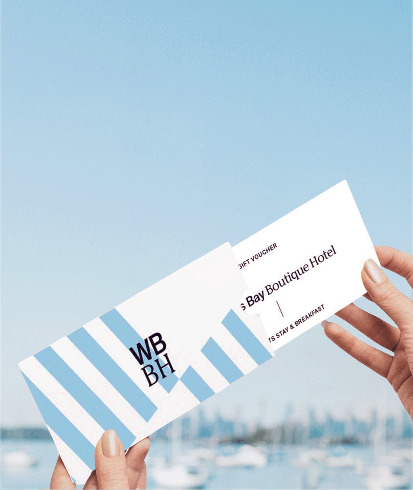
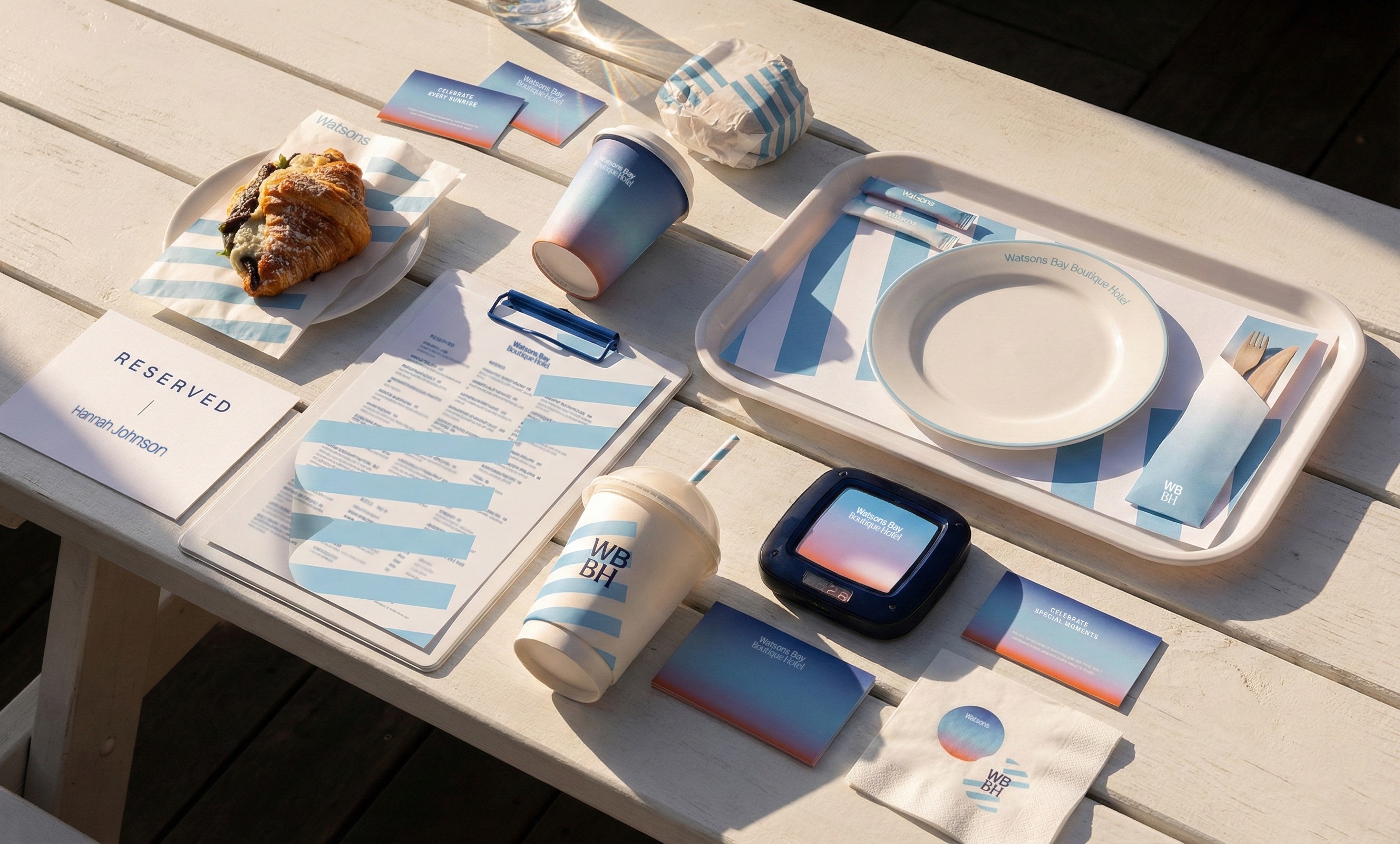
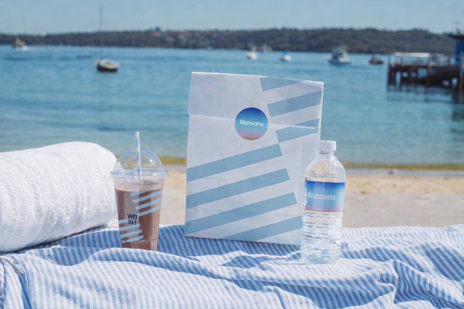
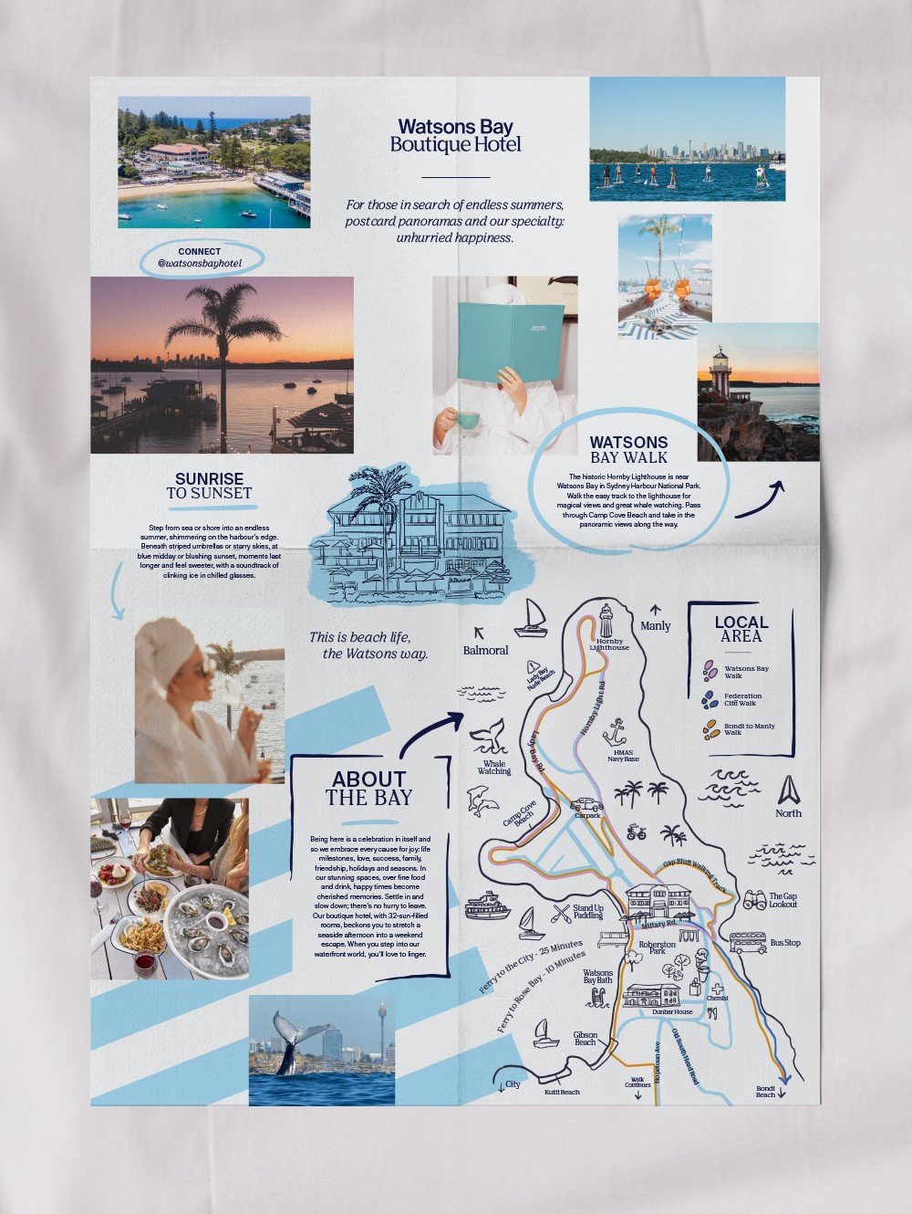
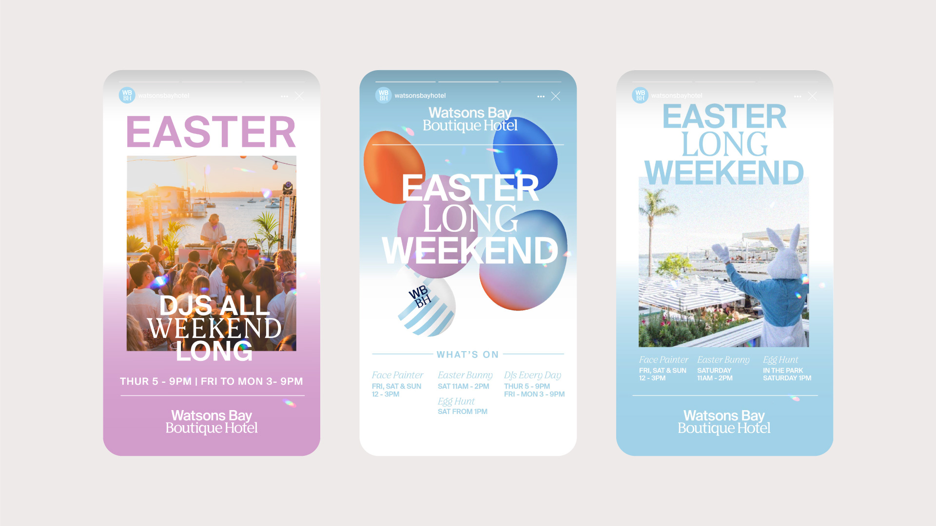
A graphic device built from the hotel's signature beach umbrellas, rendered as angled stripes, gave the brand a bold, recognisable shorthand that worked equally well as a hero moment and a supporting texture. The colour palette was drawn directly from the venue's most iconic natural feature: the Watsons Bay sunset. Gradient transitions were built to echo the upward drift of dusk light, warm hues lifting toward the sky. The concept extended into the brand's visual language through layering and blur. Elements sit at different depths, shifting along the z-axis, animated in motion to feel like they're drifting gently rather than snapping into place. Static layouts carry the same quality, foreground elements slightly out of focus, compositions breathing rather than fixed.
Application
The identity rolled out across the full venue: menus, signage, digital, environmental graphics, and motion. The system was designed to flex across a multi-venue context while staying rooted in that one feeling.


Outcome
The rebrand gave Watsons Bay Boutique Hotel a visual language as distinctive as the place itself, one that worked as hard in a social post as it did on a menu or a welcome sign. The identity captured the venue at a particular moment in its history.
View More Projects

© 2026
About


