
Whalebridge
Challenge
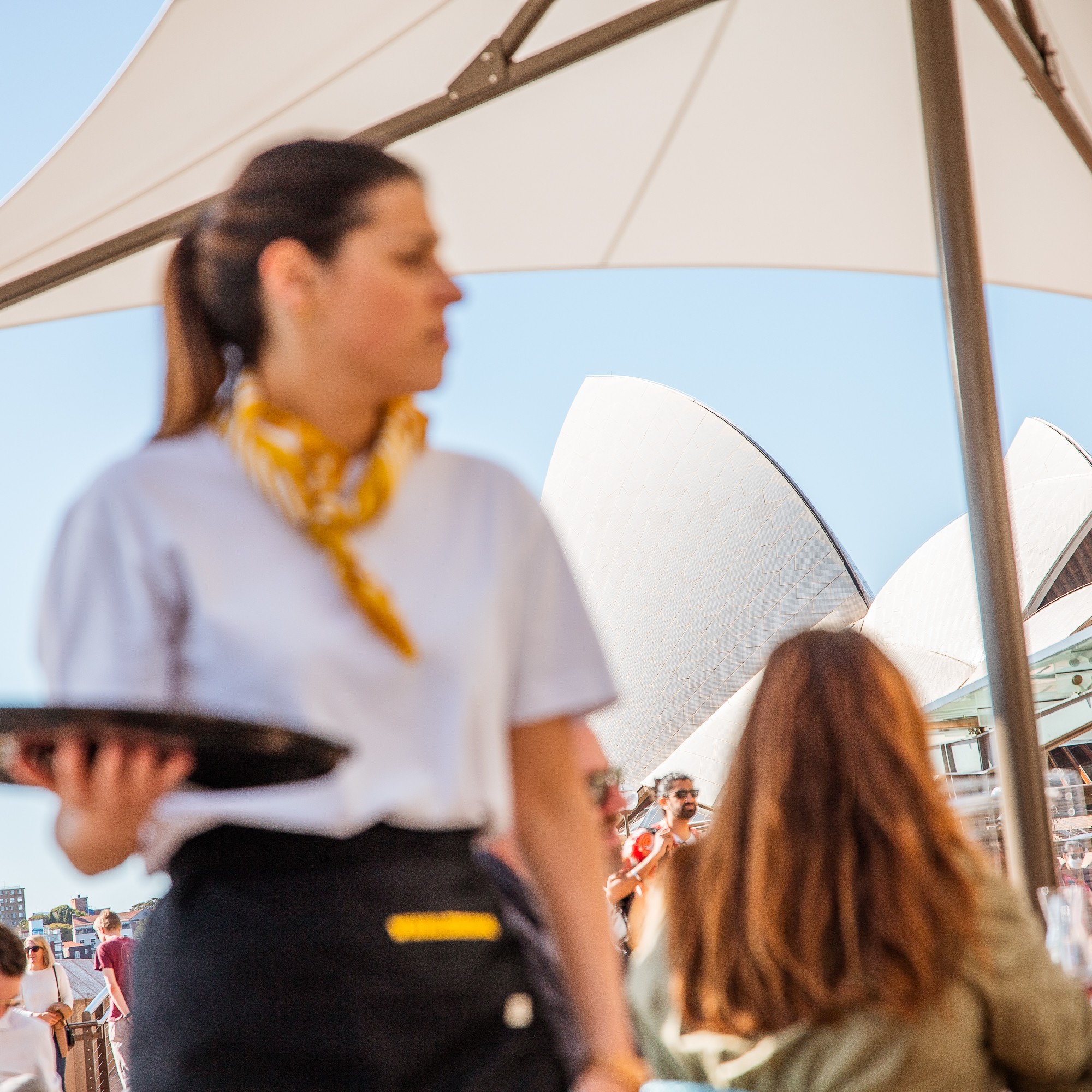
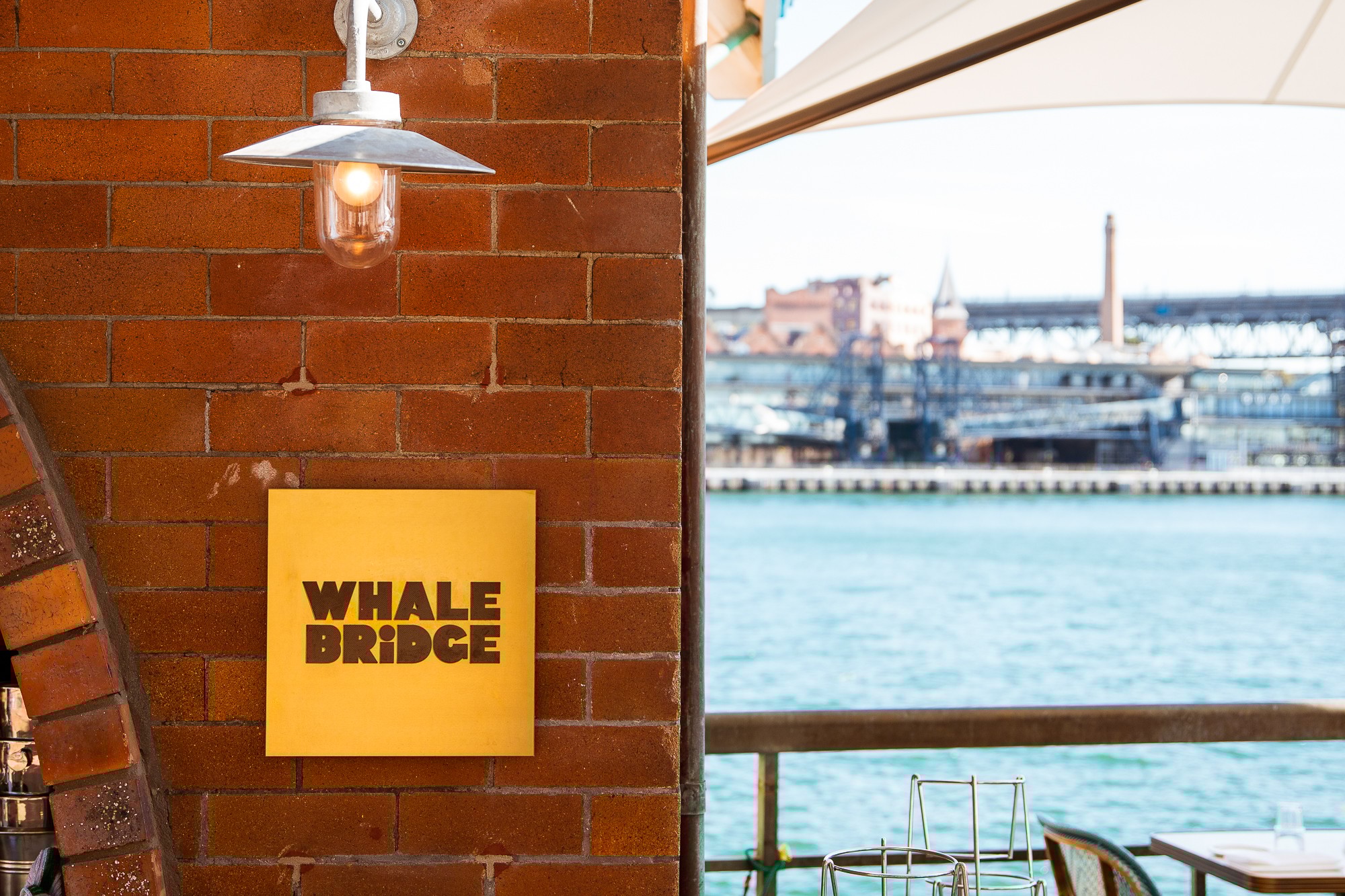
Nestled in the heart of Circular Quay, where tourists, travelers, and locals converge, Whalebridge welcomes the curious, the creative, the free-spirited, and the hungry. Against the backdrop of cruise ships and the Opera House, Circular Quay is one of Sydney’s great crossroads, where travel meets theatre and everyday life meets drama. Whalebridge needed an identity to match: adventurous, playful, and effortlessly classic. The brief was to create a French bistro brand that felt timeless without being precious, lively without losing sophistication, bridging heritage French culture with sun-drenched Sydney harbour.
Client
The Sydney Collective
Services
Brand Design
Industries
Hospitality


Strategy
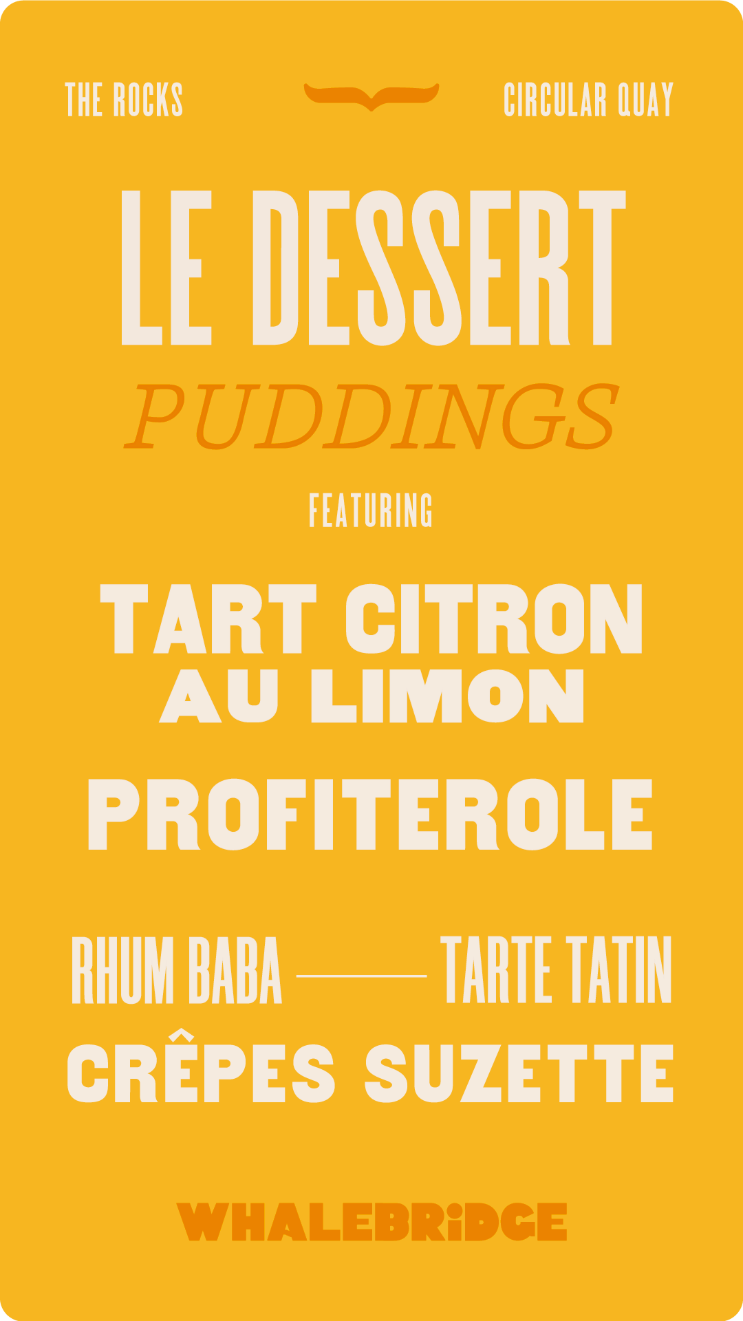
The name pointed the way. Whalebridge draws on the migratory patterns of whales, symbolizing travel, transit, and the spirit of the open water. From this came a positioning: a traditional French bistro with a playful edge. A touch of French finesse in a harbour-side setting. The idea of bridging became literal and creative from Sydney and Paris, old world and new, theatre bill and menu, French phrase and English translation.


Identity
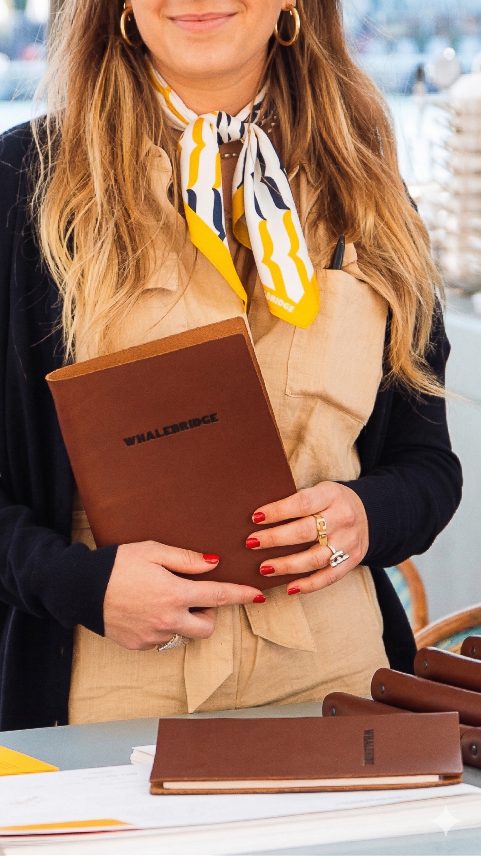
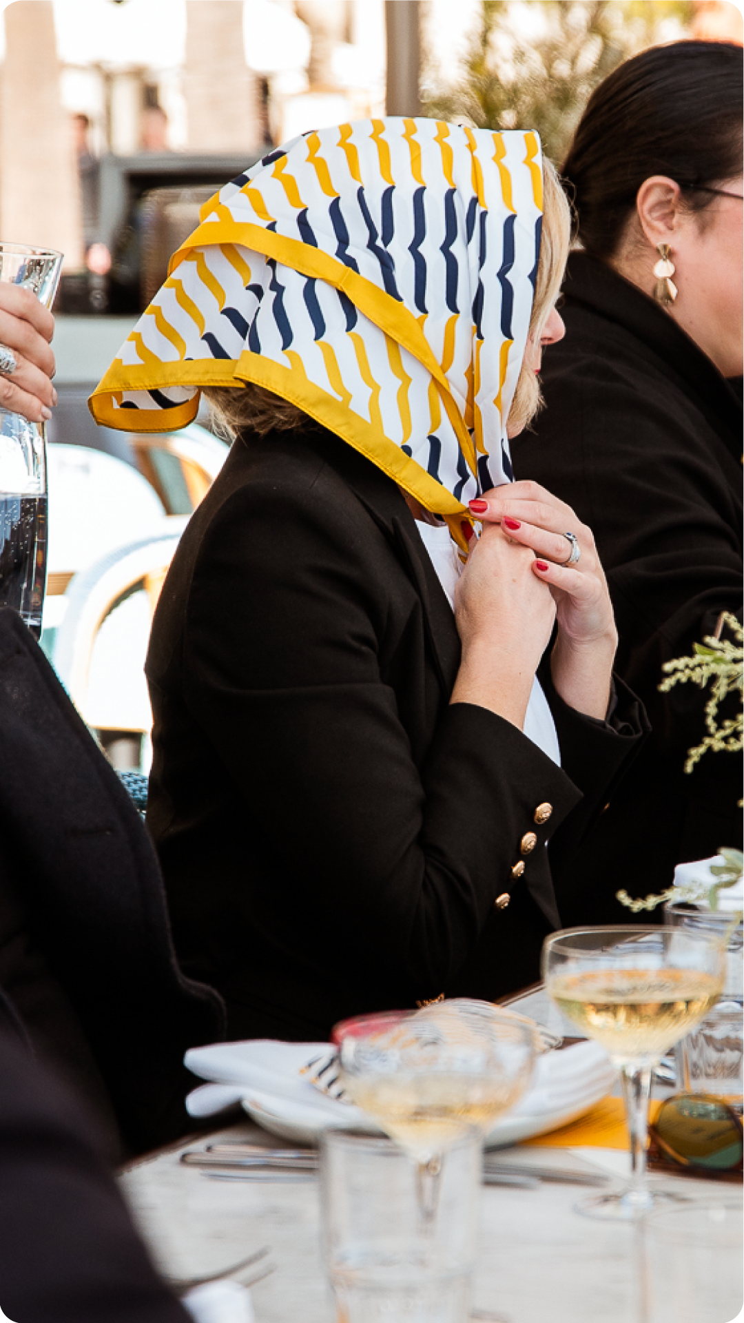
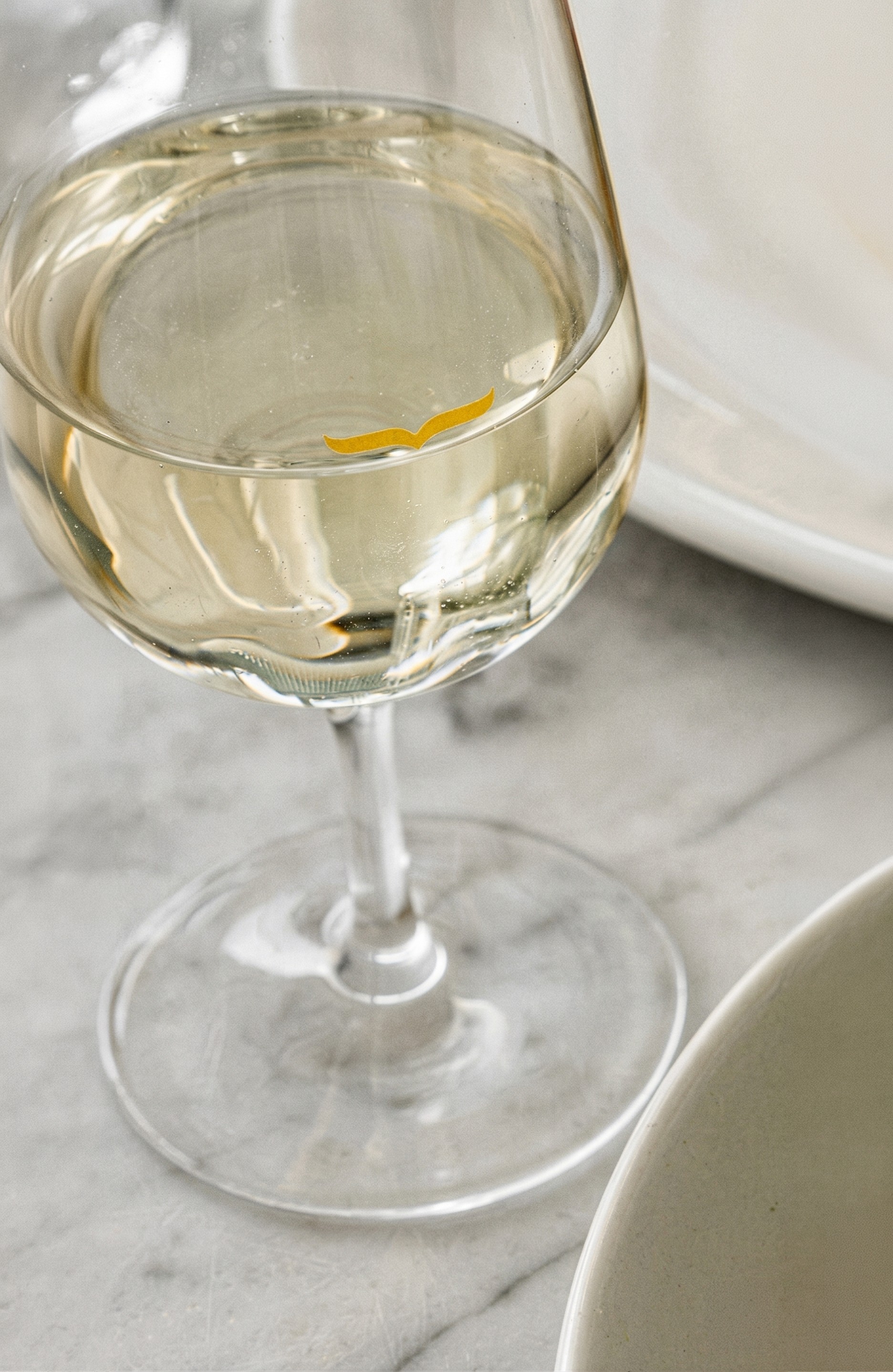
The visual identity drew inspiration from vintage French theatre posters, treating the venue itself as an experience worth announcing. The whale fin appears subtly, peeking from glassware at the plimsoll line and framing key elements. French phrases paired with their English translations thread through the type, highlighting the brand’s bilingual tension. A system of passport-stamp motifs reinforces the spirit of travel and discovery, while a warm, sun-soaked palette anchored by deep yellow completes the look.


Application
The identity translated across a full suite of venue touchpoints: brass signage, custom gold leaf signage, hand-painted garage doors, custom scarves, aprons, pins, and shirts, plates, glassware with the whale tail detail, and artwork throughout the space drawn from the vintage theatre poster reference.


Outcome
Whalebridge opened as exactly what it set out to be: a little corner of Paris dropped into one of Sydney's most trafficked and storied locations. The identity gave a new venue an immediate sense of history, romance, and wit.
View More Projects


